Company Performance
Annual Overview
The following chart shows us an overview of how our company is doing and a preliminary outlook for the future.
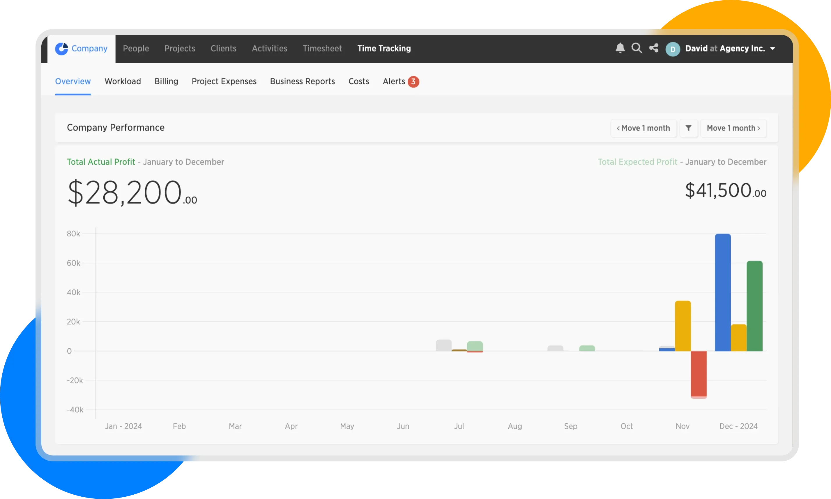
Company Performance
To understand what each color and value in the chart represents, hover your mouse over a specific month in the chart.
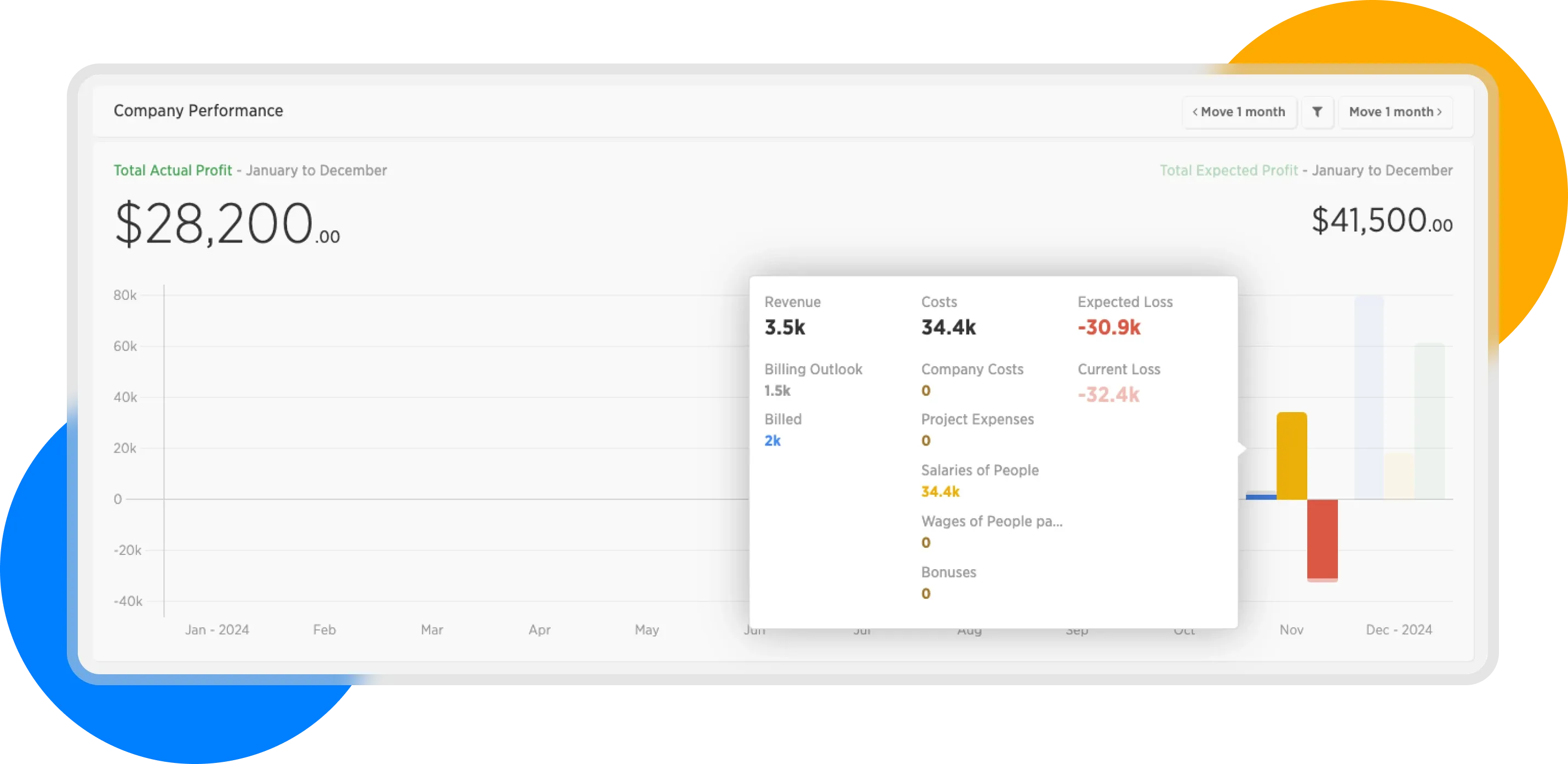
Company Performance - month detail
Here we see the values broken down into three columns—these correspond to the three bars in the chart.
Revenue
The first column shows us revenue—it is represented in this chart by revenue. It includes:
- Billed - that is, invoicing items that are marked as invoiced—this part is represented in the chart by the blue color.
- Billing outlook - what remains to be invoiced; this is the gray part of the first column.
- Revenue is then the sum of these two items.
Costs
Costs consist of 5 separate parts and are represented by the middle column in the chart:
- The salaries of people in the company are presented in light brown. This is the sum of salaries in the given month that we have set for people with a Monthly salary.
- Then, other costs are shown in dark brown:
- Company Costs - i.e., our overhead costs (offices, leases, equipment rental, etc.)
- Project Expenses - costs related to project implementation
- Costs of People paid by hour (i.e., people with the salary type "Hourly Rate")
- Bonuses - any bonuses we have given to employees
Profit
Profit is divided into 2 parts:
- Expected Profit - Profit calculated as Total Revenue - Costs (i.e., the revenue we expect if we bill everything in the given month, after deducting costs.)
- Current Profit - Profit calculated as Billed - Costs (As revenue in this period, only the already billed items are counted after deducting costs.)
Month Detail
By clicking on the chart, we get to the details of the selected month, where we can see the above-mentioned categories, including individual items:
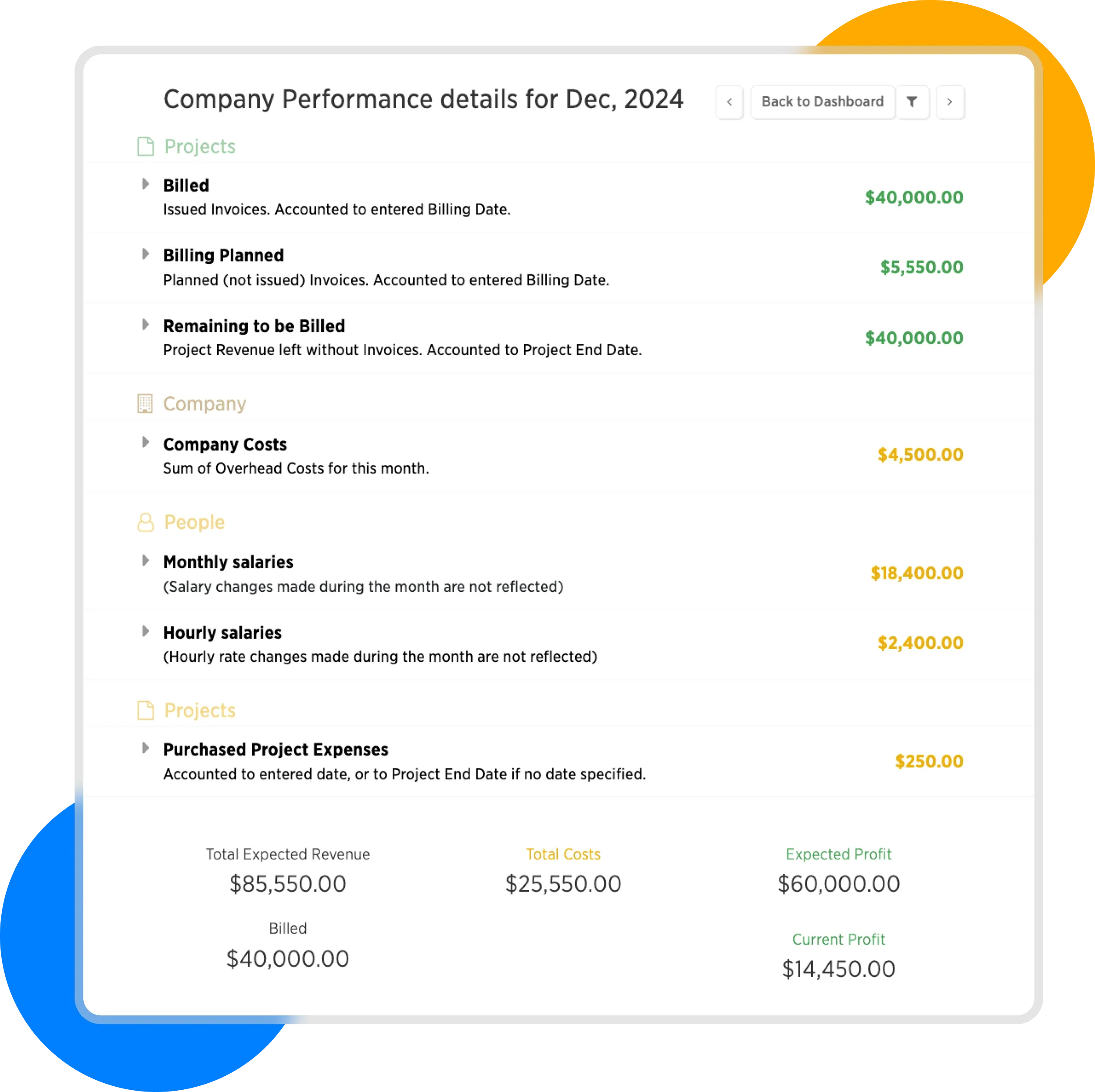
In the month detail, we see a detailed breakdown of financial performance.